



Motion Principles
Motion is often the last thing considered in interface design. Designers focus on layout and color, engineers build the structure, and motion gets added at the end if time permits. This is backwards. Motion should be part of the design from the start because it carries meaning. A transition tells the user where something came from, where it's going, and what happened in between.
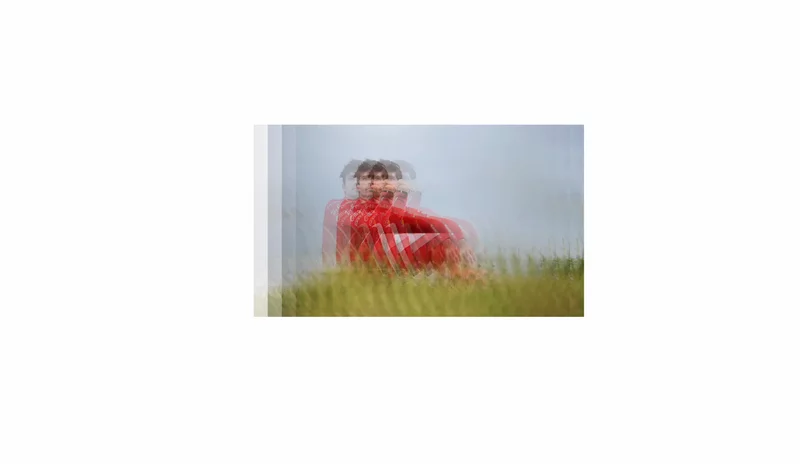
Good motion feels natural. It doesn't distract. It doesn't fight the user's intentions. It works so well that people notice it unconsciously—they experience a feeling of smoothness without thinking about the animation itself. Bad motion calls attention to itself. It feels slow or jerky or disconnected from the action the user took.
The difference between good and bad motion comes down to three principles: timing, easing, and purpose.
Timing tells the story
Every animation needs a duration. The duration should reflect the distance traveled and the importance of the transition. A button changing color might animate in 100–150 milliseconds. A panel sliding in from the side might take 300–500 milliseconds. A page transition might take 600 milliseconds or more.
The rule of thumb is simple: faster for small, local changes, slower for larger transitions. If an animation feels slow, you might be able to speed it up without losing the sense of intentionality. If it feels twitchy, slow it down.
Motion should also describe cause and effect. When a user taps a button and something happens, the timing should create a perceptible link between the two events. If the animation is too fast, the user won't see the change. If it's too slow, it feels disconnected from the action. The sweet spot is usually under half a second.
Duration principles for common patterns:
- Button state changes: 100–150ms
- Micro-interactions (hover, focus): 150–200ms
- Modal or panel entrance: 300–400ms
- Page transitions: 400–600ms
- Complex animations (many elements): 600–1000ms
Long animations (over 1 second) are rare in product interfaces. They're usually reserved for onboarding flows or demonstrative animations that aren't part of the core interaction. Shorter animations feel snappier and keep the interface responsive.
Easing is intent
Easing is where animation becomes expressive. Linear easing (the same speed from start to finish) feels mechanical and robotic. Human motion is never linear. An object accelerates at the beginning and decelerates at the end. Eyes move with anticipation. Fingers slow down before they stop.
The most common easing curve in modern interfaces is ease-out: start fast, end slow. This feels natural and intentional. The element rushes in and settles into place. Ease-out works for entrances and most transitions.
For exits, ease-in (start slow, end fast) can work, creating a sense of momentum as the element leaves. But be careful: ease-in alone can feel abrupt. Often, a combined curve that eases out for the entrance and in for the exit works better than switching between them.
Ease-in-out (slow at both ends) feels bouncy and is good for subtle transitions, but overusing it makes everything feel bouncy.
A few practical easing guidelines:
- Entrances: ease-out, or a bounce if the mood is playful.
- Exits: ease-in slightly (maybe ease-out/ease-in combined), or just linear with a slightly faster duration.
- Continuous loops (spinners, progress): linear, always.
- User-controlled dragging: no easing (linear), until the user lets go, then ease-out to deceleration.
Tools like Cubic Bezier let you visualize easing curves and fine-tune them. Using well-designed easing is one of the simplest ways to make an interface feel more intentional.
Continuity through transforms
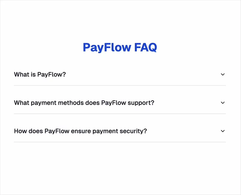
When something changes state—a drawer opens, a card expands, a menu appears—motion should preserve continuity. The user should be able to trace a line from the before state to the after state.
This is especially important when elements move on screen. If a button is at coordinates (100, 100) and a modal appears with its close button at (500, 500), the eye naturally searches for the connection. Animating the button's position is one way to show that connection. Animating the modal in from where the button was is another.
Continuity comes from several techniques:
- Shared element transitions: the same element "moves" from one place to another.
- Staggered animations: elements enter in sequence, showing order and priority.
- Matching timing: if one element takes 300ms to enter, related elements should too.
- Matched easing: if one element eases-out, others in the sequence should too.
When elements in a transition use different timings and easing curves, the overall effect feels chaotic. When they're coordinated, they feel like a system.
Purposeful motion, not decoration
The most important principle is the simplest: every animation should have a reason. If an animation doesn't clarify, guide attention, or communicate state, remove it.
This is hard because animation is fun to build. It's easy to add a spin, a bounce, a fade to everything. But every animation costs milliseconds, adds cognitive load, and risks distracting from the interface's actual purpose. Restraint is usually better.
Motion should serve one of these purposes:
- Clarify causality: show that the user's action had an effect.
- Guide attention: draw the eye to the important thing that just changed.
- Show state: indicate that something is loading, disabled, transitioning, or ready.
- Smooth perception: make a transition feel less jarring, even if it takes slightly longer.
If an animation doesn't fit one of these categories, delete it. Your interface will feel faster and more focused, and users will thank you by not being distracted.
The best motion is often invisible. The user feels like something is happening, but they couldn't describe the animation if asked. That's the goal: a feeling of continuity and intentionality, not a animation showcase.