



Now Playing

YouTube Music's now-playing screen is three layouts pretending to be one.
At rest it's a record sleeve: big album art, title, a row of actions, the scrubber, the transport. Pull up the queue and the art swells to the edges of the screen while the controls ride up to meet the list. Keep pulling and the art collapses into a 40px thumbnail in a mini bar at the top, and the queue becomes the page.
There's no button for any of this. It's one drag, and every element on the screen knows where it should be at every point along it.
I wanted to rebuild it, and more than that I wanted to rebuild it in an order that wouldn't let me fool myself. So this is less about the finished screen than the six prototypes it took to get there, each one adding a single idea to the last.
Observations
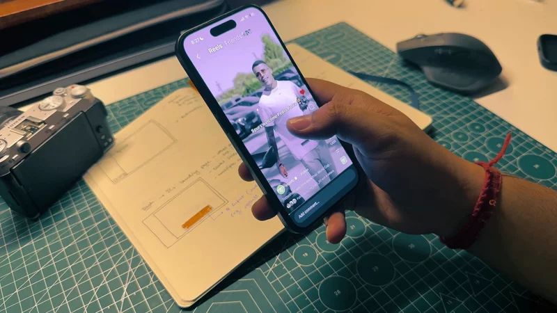
I recorded the transition and stepped through it slowly, the same way I do with anything I'm about to copy.
Here are the three states, the way they ended up in my notes. Step through them; it's the real player underneath.
The first thing I noticed is that the album doesn't move in one direction. From the resting state it gets bigger — wider than its own padding, full-bleed — and only then shrinks into the corner. Whatever drives it can't be a simple "open" and "closed", because the middle isn't between the ends.
The second is that the sheet stops halfway. Even a hard flick from the bottom lands on the middle state first. That state isn't a waypoint, it's a place: it's where you'd sit to glance at what's next without losing the player.
The third is that everything moves at once, but not together. The title and transport slide up during the first half of the drag and are gone almost the moment the second half starts. The mini bar at the top only appears in the second half. The queue's header fades in during the first. Nine or so things, each with its own idea of when to move.
One square, three poses
Before any sheet, I wanted the album alone. One grey square, and one number that says where it is.
Grey on purpose. Real album art is very good at making a layout look finished before it is — a 2px misalignment disappears into a photograph and stays there. A grey block on white has nowhere to hide.
The number runs from 0 to 2, and every property of the square is a three-stop interpolation over it:
12345678910const albumStyle = useAnimatedStyle(() => { const t = state.value; return { top: interpolate(t, [0, 1, 2], [albumStartTop, 0, albumEndTop], CLAMP), left: interpolate(t, [0, 1, 2], [albumStartLeft, 0, albumEndLeft], CLAMP), width: interpolate(t, [0, 1, 2], [albumStartSide, screenWidth, 40], CLAMP), height: interpolate(t, [0, 1, 2], [albumStartSide, screenWidth, 40], CLAMP), borderRadius: interpolate(t, [0, 1, 2], [16, 0, 12], CLAMP), };});Three stops, not two. With only the ends, the square would shrink from its resting size to the thumbnail and never pass through full-bleed. The middle stop is the one the observation was about, and it's the one a two-keyframe tween can't express.
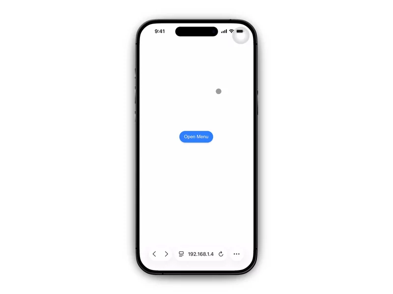
The prototype drove state two ways: three buttons that animate to 0, 1 or 2,
and a scrub track that sets it directly. The track fires a selection haptic
whenever Math.round(state) changes — you feel each pose go past under your
thumb, which turned out to be the quickest way to find out whether the
in-between frames were any good.
123456const updateFromX = (x: number) => { "worklet"; const before = Math.round(state.value); state.value = clamp(((x - THUMB / 2) * 2) / thumbRange, 0, 2); if (Math.round(state.value) !== before) runOnJS(hapticSelection)();};The second prototype added readouts — x, y, size, radius, printed live with an
AnimatedTextInput for the same reason as last time:
sixty React renders a second to print a number is a bad trade. Turn on ghosts
in the panel to see the three poses the square is travelling between.
Scrub slowly from 0 to 1. The square leaves its padding before it reaches its full width, and the corners square off on the way. That's all the album will ever do. Everything after this is about getting the rest of the screen to agree with it.
Hand the number to the sheet
The slider was standing in for a gesture I didn't have yet. The real control is a bottom sheet with three snap points: peeking at the bottom, 40% of the screen, and nearly all of it.
The useful thing about @gorhom/bottom-sheet here is animatedIndex. It's a
shared value that tracks the sheet's position in snap-point space — 0 at the
first snap, 1 at the second, 1.5 halfway between the second and third — and it
updates every frame of a drag, not just when the sheet settles. Which makes it
exactly the number the square was already reading.
123456789101112const animatedIndex = useSharedValue(0);const snapPoints = useMemo(  () => [peekHeight, "40%", screenHeight - 120],  [peekHeight, screenHeight],);
<BottomSheet  snapPoints={snapPoints}  animatedIndex={animatedIndex}  onAnimate={handleAnimate}  enableDynamicSizing={false}>
state becomes animatedIndex and the album code doesn't change at all. That
was the whole reason to start with a bare number — the square never knew what
was moving it.
The second observation, the sheet stopping halfway, needs one more piece.
Out of the box, a hard flick from the peek carries the sheet straight to the
top. The album still passes through full-bleed on the way — the index is
continuous — but for about a hundred milliseconds, which reads as a flash
rather than a state. onAnimate fires as the sheet commits to a target, and
that's the moment to overrule it:
1234567const handleAnimate = useCallback((from: number, to: number) => { if (Math.abs(to - from) > 1) { // Never skip the middle: redirect to the neighbouring snap instead. const target = from + Math.sign(to - from); requestAnimationFrame(() => sheetRef.current?.snapToIndex(target)); }}, []);The requestAnimationFrame matters. Calling snapToIndex synchronously from
inside the sheet's own animation callback gets overwritten by the animation
that's about to start. Deferring it a frame lets the sheet begin its move and
then redirects it.
Drag the sheet below. Then turn off one step and flick hard from the bottom
— the album still does its full-bleed pose, just too fast to register as
anything.
Everything else is a range
With the album and the sheet agreeing, the rest of the screen went in as grey blocks too: a top row (collapse chevron, audio/video toggle, menu), then a group underneath the album with the title, the action chips, the progress bar and the transport.
Every one of them reads animatedIndex. None of them reads all of it.
That was the idea the whole prototype turned on. The album is the only element that animates across the full 0 to 2. Everything else picks a half:
1234567891011// First half: the player makes room for the queue.const row4Style = useAnimatedStyle(() => ({  opacity: interpolate(animatedIndex.value, [0, 1], [1, 0], CLAMP),  height: interpolate(animatedIndex.value, [0, 1], [ROW4_HEIGHT, 0], CLAMP),  marginTop: interpolate(animatedIndex.value, [0, 1], [24, 0], CLAMP),}));
// Second half: the queue becomes the page.const topBarStyle = useAnimatedStyle(() => ({  opacity: interpolate(animatedIndex.value, [1, 2], [0, 1], CLAMP),}));
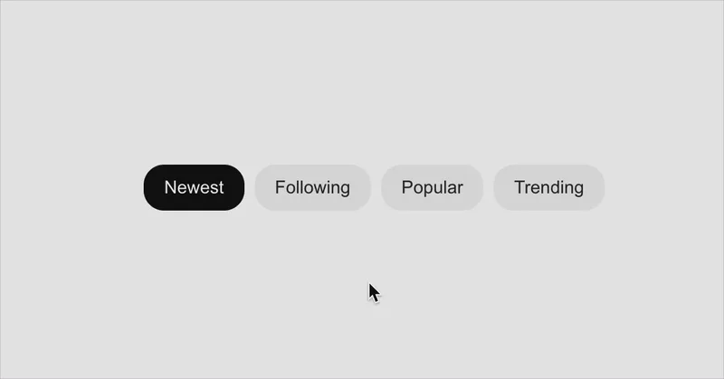
The first half belongs to the player making room. The action chips collapse — height, margin and opacity together, so the rows below close the gap rather than leaving a hole. The whole group slides up to sit on top of the sheet. The sheet swaps its "Your queue" label for a proper header with filter chips.
The second half belongs to the queue. The sheet's background goes from transparent to opaque. The top row fades out, and the mini bar fades in where it was.
No element knows about any other. The controls don't check whether the top bar is visible; they're just gone by 1.2, and the top bar just isn't there before
- The choreography lives entirely in which slice of one number each of them picked.
Where the controls stop
The group's lift is the one value that isn't a nice round range. At the middle snap, the group's bottom edge should sit exactly on the sheet's top edge. That's arithmetic:
1234const groupOriginalTop = albumStartTop + albumStartSide + 24;const sheetTopAt40 = screenHeight * 0.6;const groupTranslateY = sheetTopAt40 - GROUP_HEIGHT_COLLAPSED - groupOriginalTop;GROUP_HEIGHT_COLLAPSED is the group's height after the action row has
collapsed, and it's hand-measured. It was 208 in one prototype and 192 in the
next, because a row changed and the constant didn't know. It's the most fragile
number in the file and I've left it that way on purpose — measuring it with
onLayout would need the collapsed layout, which only exists at index 1, which
is after the moment you need it.
A gesture for the rest of the screen
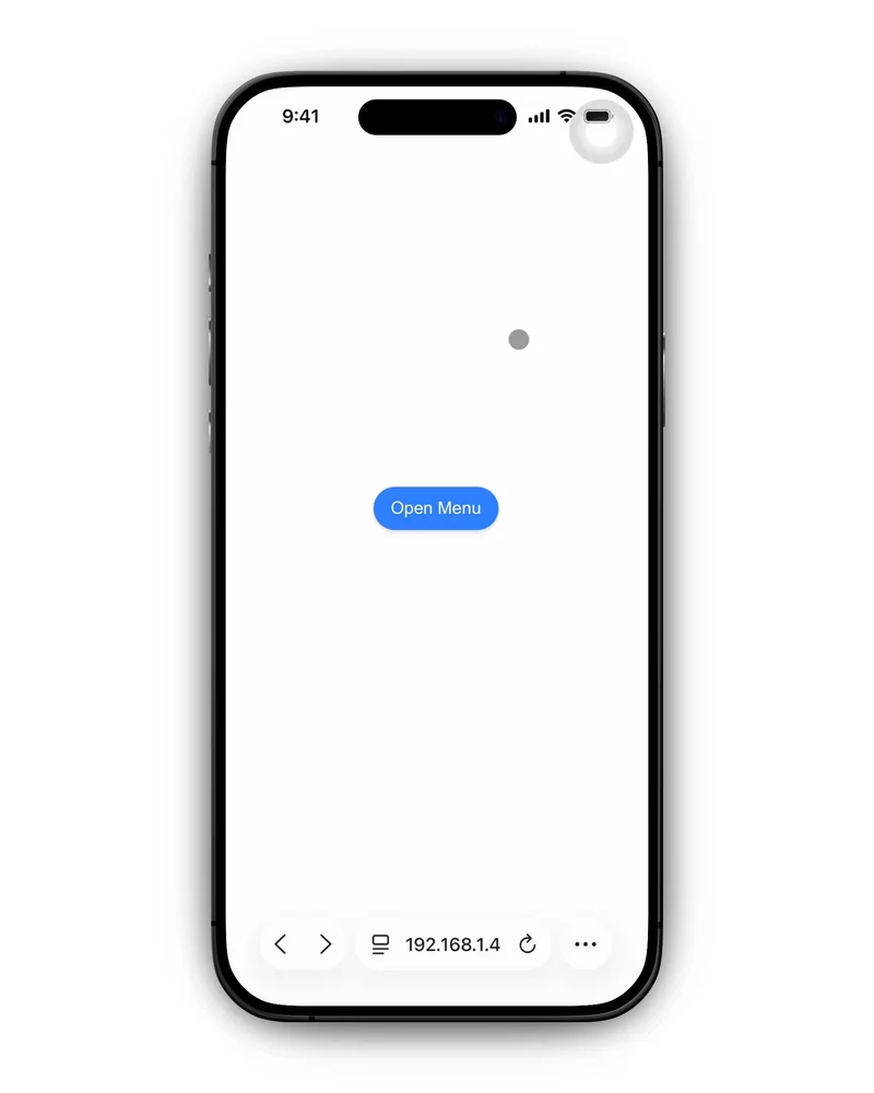
The sheet's handle is a small target. On the real app you can drag anywhere on the player and the sheet responds, so the prototype puts a pan on the whole screen:
1234567891011const screenGesture = Gesture.Pan() .activeOffsetY([-15, 15]) .failOffsetX([-20, 20]) .onEnd((e) => { "worklet"; const up = e.translationY < -50 || e.velocityY < -500; const down = e.translationY > 50 || e.velocityY > 500; if (!up && !down) return; const current = Math.round(animatedIndex.value); runOnJS(snapTo)(clamp(current + (up ? 1 : -1), 0, 2)); });It doesn't track the finger. It waits for a flick and steps one snap. There's nothing under your finger on the album to hold on to, so a sheet that follows a drag that started there feels oddly remote — a flick that says "next state" is closer to what the gesture means.
The two offsets are what let it share the screen. activeOffsetY won't claim
the touch until it's moved 15px vertically; failOffsetX gives up if it moves
20px sideways first. A horizontal swipe on the album — skip track, in the real
app — never gets mistaken for a request to open the queue.
Drag the sheet in this one, or flick anywhere on the player. The timeline next to it is the table above, drawn: each bar is the slice of the index that row animates over, and the line is the live value.
The seams
The skeleton worked, and the next prototype was entirely about the places where it didn't look right.
The queue slid under the controls. At the middle snap, the sheet's list scrolls up behind the controls group — but the sheet is transparent there, so song rows showed through the gap between the title and the progress bar. The fix is a gradient behind the group, fading from transparent to the background colour, that only exists in the first half:
1234567const groupGradientStyle = useAnimatedStyle(() => ({  opacity: interpolate(animatedIndex.value, [0, 1], [0, 1], CLAMP),}));
<Animated.View style={[{ position: "absolute", top: -100, bottom: 0 }, groupGradientStyle]}>  <LinearGradient colors={["transparent", BG, BG]} locations={[0, 0.7, 1]} /></Animated.View>
It starts 100px above the group on purpose. At index 1 the album is full-bleed and its bottom edge overlaps the top of the lifted group; the gradient is what turns that hard edge into the art dissolving into the controls.
The controls lingered. In the skeleton they faded out over the whole
second half, [1, 2]. But the sheet goes opaque over that same half, and for
most of it the controls were visibly sitting on top of a sheet that was
supposed to be covering them. Changing the range to [1, 1.2] — a fifth of
the half — means they're gone before the sheet has any opacity worth
mentioning.
The [1, 1.2] is the whole change. Everything else in the second half kept
its full range.
12343456opacity: interpolate(animatedIndex.value,[1, 2],[1, 0],[1, 1.2, 2],[1, 0, 0],CLAMP,),The insets disagreed. v7 passed bottomInset to the sheet and computed
the middle snap's position as (screenHeight - insets.bottom) * 0.6. v7.1
folds the inset into the peek height instead and uses screenHeight * 0.6.
Both are defensible; mixing them is not, and the symptom was the group landing
a home-indicator's height away from the sheet it was meant to rest on. Pick
one coordinate space and compute every number in it.
Both of the first two are in the panel for the skeleton above. Turn off
gradient and stop at the middle snap; push fade window up to 1 and drag
slowly through the second half.
Paint
Only after all of that did any colour go in.
The last prototype swaps every grey block for the real thing — icons, type, cover art, the dark red the app pulls out of the album. It adds three small pieces of motion:
- The screen's background gradient fades out over
[1, 2], so the player's colour hands over to the sheet's. - A dark band at the top of the screen fades in and back out over
[0, 1, 2] → [0, 1, 0]. It only exists when the album is full-bleed, which is exactly when the white icons in the top row would otherwise be sitting on whatever the art happens to be. - The mini bar's title and buttons slide down 20px as they fade in, rather than just appearing.
What it doesn't do is change a single range from v7.1. Every slice in the timeline above is the same. That's the payoff for building it grey: by the time there was anything to make pretty, there was nothing left to get right.
Doing this on the web
Every demo on this page is a browser rebuild, and the mapping is mostly mechanical.
animatedIndex has to be built by hand. There's no sheet library to hand
it to you, but it's only the sheet's height mapped through its own snap
points:
123useMotionValueEvent(height, "change", (v) => index.set(interpolate(v, snaps, [0, 1, 2])),);Everything downstream reads index and never sees a pixel, so the snap points
can move — a resize, a different phone — without touching any row's range.
Animate a transform, not the box. The prototype animates the album's
top, left, width and height. Reanimated can get away with that because
it runs on the UI thread. On the web, each of those is a layout property, and
changing one every frame re-lays-out the page. The demos lay the album out once
at full-bleed size and move it with translate and scale from its top-left
corner instead.
The catch is that scale scales everything, corners included. A 6px radius on a square scaled to a tenth of its size renders as 0.6px. So the radius is divided back out:
1234const borderRadius = useTransform(state, (t) => { const pose = albumAt(t); return pose.radius / (pose.side / SCREEN_W);});Pointer deltas need un-scaling. The phone in these demos renders at 390
logical pixels and is scaled down to fit the column. A pointer moving 10px on
your screen is moving more than 10px in the phone's coordinates, so every drag
divides by that scale first — the same class of bug as forgetting a parent's
offset in onLayout, and with the same symptom: a sheet that drifts away from
your finger.
The flick is two numbers. Gesture Handler gives you velocityY for free.
On the web it's the last few pointer samples, distance over time, and then the
same thresholds as before — 50px or 500px/s.
That's it. The sheet, the index and nine ranges are the whole screen. The rest was choosing which half of a number each thing gets to have.