








Spacing Systems
Spacing is invisible when it's right and immediately obvious when it's wrong. Too much space and an interface feels disconnected and disorganized. Too little and it feels cramped and chaotic. The difference between a polished, professional interface and an amateur one often comes down to how carefully spacing has been considered.
Spacing is the foundation of hierarchy. Bold colors and fancy typography might catch attention, but spacing determines what the eye reads first, second, and third. It groups related elements and separates unrelated ones. It creates rhythm and guide the eye across the page. When spacing is systematic—when it flows from a single scale—an interface gains coherence that no amount of color adjustment can achieve.
One scale to rule them all
The best spacing systems are built on a single base unit. Common choices are 4px, 8px, or 16px. Every spacing value in the system is a multiple of this unit. A button's padding might be 8px (2 units). A card's margin might be 24px (3 units). A section's gap might be 48px (6 units).
Why use a scale at all? Because consistency and predictability build trust. When users look at a well-spaced interface, they sense that someone thought about it. They don't consciously notice the spacing, but they feel it. Everything feels intentional.
A single scale to rule them all keeps the system honest:
- Steps grow geometrically, so relationships stay legible.
- Every gap has a rationale, never a magic number.
- Density can change (compact vs. spacious) by scaling the unit, not by individual override.
If you choose 8px as your base unit, your scale might look like: 4, 8, 12, 16, 20, 24, 32, 40, 48, 56, 64, 72, 80. Each step has a reason. Small increments (4–24) are for tight, dense layouts. Medium increments (32–48) are for breathing room. Large increments (56–80) are for major section divisions.
The step sizes matter. Growing by 8px each time works well for small spaces (0–48px), but for larger spaces, jump by 16px or use a ratio like 1.5x. A scale that uses consistent arithmetic increments across all ranges tends to have too many values in the middle and too few at the edges.
Rhythm you can feel
Spacing creates rhythm. Regular intervals create predictability. Irregular intervals create emphasis. A list where every item is separated by 16px feels uniform. A list where the first item has 16px separation but the second has 24px draws attention to the second item. This is powerful when it's intentional and confusing when it's accidental.
Rhythm typically flows vertically on longer pages. As readers scroll, they see repeating patterns of content blocks, dividers, and spacing. When these patterns are consistent, reading feels natural. When they break, the eye stops and re-examines.
To build rhythm, establish patterns at the component level, then at the page level:
- A card might have 16px internal padding and 24px gap between cards.
- A section might have 48px top padding and 64px gap between sections.
- A full-page layout might have 80px between major sections and 120px before the footer.
These shouldn't be random. They should derive from your scale. A 48px section gap is 6x your 8px base unit. A 16px component padding is 2x. The ratios create internal harmony.
Density and context matter
The same content can be spaced differently for different contexts. A dense dashboard might use a 4px base unit and aggressive spacing. A simple marketing site might use 12px or 16px. A mobile app might shift to a larger base unit to accommodate finger-sized touch targets.
Rather than rebuilding your spacing system for each context, establish a density setting. If your base unit is 8px (tight) vs. 12px (comfortable) vs. 16px (spacious), all values scale proportionally. A component that uses 3x the base unit will always use 3x, whether that's 24px (tight), 36px (comfortable), or 48px (spacious).
This approach scales beautifully. You don't override individual spacing values across dozens of components. You change the density setting and everything adjusts. It also makes mobile-responsive design easier. On mobile, you might switch to a more comfortable base unit to reduce cramping.
Horizontal spacing follows similar principles but with slight differences:
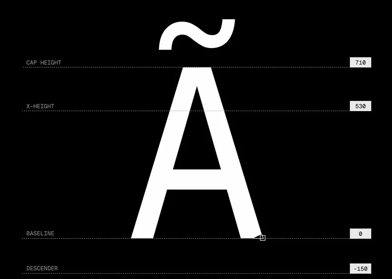
- In left-to-right languages, use familiar x-height measurements to guide margin width. A paragraph might be 65–75 characters wide for readability.
- Columns in a grid should use consistent gutters, usually 16–32px.
- Buttons and form fields should have adequate horizontal padding (12–24px).
The relationship between spacing and other tools
Spacing doesn't exist in isolation. It works with color, typography, and motion to create hierarchy and guide attention.
Color draws attention, but spacing provides breathing room. A bright red element surrounded by plenty of whitespace has more impact than the same element surrounded by clutter.
Typography defines content importance through size and weight, but spacing enforces that hierarchy. A large heading with very tight spacing underneath feels cramped, reducing its impact. The same heading with generous spacing underneath creates a clear pause before the next section.
Motion (transitions and animations) feels smoother when spacing is already logical. If the layout is chaotic, even smooth animations feel out of place. If the layout is well-spaced, motion enhances it.
Testing spacing at scale
Spacing decisions that look right in mockups sometimes fail when applied at scale. A 24px gap between cards might feel perfect when viewing 3 cards but overwhelming when viewing 30. Test your spacing in realistic scenarios:
- Show a long list at actual data density.
- View the interface on different screen sizes.
- Check both empty states and full states.
- Ask team members if anything feels too tight or too loose.
Read about responsive spacing techniques to handle different screen sizes gracefully.
The best spacing system is invisible. Users don't think about it. They just feel like the interface breathes, flows, and makes sense. That feeling comes from months of small decisions—picking the right scale, applying it consistently, and testing to confirm it works at every scale. It's unglamorous work that makes everything else look better.