




YouTube Music (split)
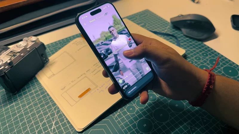
I use YouTube Music a lot. Around the middle of 2026, it rolled out a redesigned media controls screen. While the reactions were mixed, I actually liked it.
The design engineer in me loved it.
The interface and the interaction design makes it a great case study on how complex interfaces come together.
At first glance, it feels complex to build, with several elements moving and changing at once. The interactions are rich with several swipe gestures and actions. However, if you look closely enough, it's surprisingly simple.
Three States
When I started to study the interface, a few things stood out to me:
- The interactions make the interface feel continuous. Despite having various moving elements, it doesn't feel abrupt or janky.
- The interface has three distinct states.
- The central element of the whole interface and the interaction is, obviously, the album art.
Continuity makes the interface well-composed and the album art becomes the central anchor across the three distinct states.
Let’s look at the three states and how the album art moves across them. In the default state1, the album art sits above the media controls as a large square, inset from the edges of the screen. When the interface is “pushed up,” it enters the peek state2: the album art expands to fill the width of the screen while the controls move up and the queue comes into view. Push it up further into the expanded state3, and the album art shrinks into a small thumbnail in the mini player above the fully open queue.

a big square sleeve. padded in from the edges

full-bleed now. edge to edge, corners gone

small thumbnail in the mini bar
Album art
Looking at the three states, one thing is clear: the album art never leaves the screen. It grows, shrinks and moves, but it is always there. So we can't unmount or remove the element from the screen.
We use an absolutely positioned element that sits outside the normal flow of the layout, and control its position and size with four numbers:
x: how far it is from the lefty: how far it is from the topsize: how big it is. It's a square, so one number covers both sidesradius: how round its corners are
Each state is just a different set of those four numbers.
So the real question is where these numbers come from.
Setting up the numbers
Before working out the numbers for each state, let's set a few constants. Every state is built from these:
1234567const insets = useSafeAreaInsets(); // status bar and Dynamic Island, 54 at the topconst { width: screenW } = useWindowDimensions(); // 390 on this phone
const PAD = 16; // from the sides of the screenconst GAP = 8; // between stacked elementsconst TOP_ROW_H = 48; // chevron, audio/video toggle, menuconst MINI_ALBUM = 40; // the album's size in the mini bar
All of them are in logical pixels. TOP_ROW_H is the bar of controls above the album in the default state1, and MINI_ALBUM is the small thumbnail the album art collapses into in the expanded state3.
Swipe through to see how each state's position and size fall out of these.
Rather than scattering these numbers through the component, I work them out once, in a hook. It reads the insets and the screen width, and returns all four numbers for every state:
123456789101112131415161718192021222324function useAlbumPositions() {  const insets = useSafeAreaInsets();  const { width: screenW } = useWindowDimensions();
// Recomputed only when the insets or the screen width change. return useMemo( () => ({ default: { x: PAD, y: insets.top + GAP + TOP_ROW_H + GAP, size: screenW - 2 * PAD, radius: 16, }, peek: { x: 0, y: 0, size: screenW, radius: 0 }, // under the status bar expanded: { x: PAD, y: insets.top + GAP, size: MINI_ALBUM, radius: 6, }, }), [insets.top, screenW], );}Then it is one line at the top of the player, const positions = useAlbumPositions();, and every state's layout is there to read. If the insets or the screen width change, say on rotation, the positions change with them.
That gives us three sets of numbers, but the album still needs to know which set to use. So the player keeps one more value, state, that says where it is: 0 for default, 1 for peek, 2 for expanded.
The album turns state into its four numbers by interpolating: at 0 it takes the default values, at 1 the peek values, at 2 the expanded ones:
123456789101112131415161718192021222324// `default` is a reserved word, so it is renamed as it is unpacked.const { default: rest, peek, expanded } = useAlbumPositions();
const albumStyle = useAnimatedStyle(() => {  // One of the four numbers, for the current state.  const at = (key: "x" | "y" | "size" | "radius") =>    interpolate(      state.value,      [0, 1, 2],      [rest[key], peek[key], expanded[key]],      CLAMP, // hold the end values if a fling overshoots 0 or 2    );
  return {    left: at("x"),    top: at("y"),    width: at("size"),    height: at("size"), // it is a square    borderRadius: at("radius"),  };});
// styles.album is position: "absolute": out of the layout, placed by left/top.return <Animated.View style={[styles.album, albumStyle]} />;
When put together, we can see how the number changes though the state.
Between the states
Until now, we have been looking at the 3 states as checkpoints and how the album sits at each one. But we talked about how the whole interface feels continuous and interruptible.
This is where state being a number pays off. Earlier we made it 0, 1 and 2 rather than "default", "peek" and "expanded". A label can only ever be one of three things, so the album could only jump between them, or play a canned transition from one to the next.
A number can sit anywhere in between, and interpolation already knows what to do with it: at 0.5 the album is exactly halfway between default and peek, because the same interpolate function calculates the four numbers for any value of state.
Try it with the slider below. It moves state the way a finger on the sheet eventually will.
Controlling the state
A slider is fine for a demo, but there isn't one in the real player. What people actually drag is the music queue, up from the bottom of the screen.
So we need something on screen in place of the slider to control the progress of the state, and a bottom sheet is a natural fit.
We don't build the sheet ourselves. A bottom sheet already handles the hard parts, like flings, springs and a list that scrolls inside the sheet.
What we give it is a snap point per state: a height the sheet rests at. In the default state it's barely there, just the handle and the queue pill peeking up from the bottom. In peek it rises to about 40% of the screen, enough to show the start of the queue. And when expanded it goes almost all the way up, stopping just below the mini bar.
The sheet also tracks its own progress. As it moves it reports where it is as animatedIndex: 0 at the first snap point, 1 at the second, 2 at the third, and every value in between. That's the same number our slider was producing, so we pass state straight in:
123456<BottomSheet snapPoints={[peekHeight, "40%", topSnap]} // default, peek, expanded animatedIndex={state} // written every frame, not just when it settles> {/* the sheet's content: queue, lyrics, etc */}</BottomSheet>album.tsx doesn't change. Drag the sheet below and watch the album's numbers follow it.
The rest of the screen
The album isn't the only thing that moves. Everything else on the screen follows the same pull, and it's easier to look at them one at a time. Let's start at the top.
The top bar
The top bar is the row we sized as TOP_ROW_H, just below the safe area. It holds a chevron to close the player, the audio/video toggle, cast and a menu.
In the default state it simply sits above the album. Moving to peek, it doesn't move at all. The album grows to full width and slides up underneath it, so the icons end up sitting on top of the cover art.
The change comes in the expanded state. The top bar makes way for the mini bar: the album as a small thumbnail, the song's title and artist, cast and a play button. The mini bar takes the exact same spot the top bar was in, so the top of the screen never jumps.
That swap only happens between peek and expanded, so both of them read only the second half of state, from 1 to 2:
123456789101112// Fades out as the queue takes over.const topRowStyle = useAnimatedStyle(() => ({  opacity: interpolate(state.value, [1, 2], [1, 0], CLAMP),}));
// Fades in, in the same place, dropping in slightly as it does.const miniBarStyle = useAnimatedStyle(() => ({  opacity: interpolate(state.value, [1, 2], [0, 1], CLAMP),  transform: [    { translateY: interpolate(state.value, [1, 2], [-20, 0], CLAMP) },  ],}));
Between 0 and 1, neither of them does anything. The top bar stays put while the rest of the player rearranges itself around it, which is a big part of why the screen feels anchored.
The queue pill
At the bottom of the player, under the playback controls, there's a small handle and a pill that says "Your queue". It's the only hint that there's a sheet down there at all, and it's what you grab to pull it up.
As the sheet rises towards peek, the pill doesn't ride up with it and stay a pill. It fades and folds away, and in its place the queue's real header fades in: "Playing from Your queue", a Save button and a row of filter chips. The label turns into the header of the thing it was labelling.
Both happen in the first half of the pull, from 0 to 1. By the time the sheet reaches peek the pill is gone and the header is fully there, and from peek to expanded neither of them changes:
12345678910// 0 → 1: the pill fades and folds away as the sheet comes up.const pillStyle = useAnimatedStyle(() => ({  opacity: interpolate(state.value, [0, 1], [1, 0], CLAMP),  height: interpolate(state.value, [0, 1], [PILL_H, 0], CLAMP),}));
// 0 → 1: the queue's header fades in where the pill was.const headerStyle = useAnimatedStyle(() => ({  opacity: interpolate(state.value, [0, 1], [0, 1], CLAMP),}));
The pill collapses its height as well as fading. If it only faded, it would leave a 44px gap above the header. Folding it away lets the header move up into the space the pill had, so the two read as one thing changing rather than one leaving and another arriving.
The controls
Between the album and the sheet sits everything you'd use to actually play music: the song's title, a row of action chips (like, lyrics, comments), the progress bar and the playback buttons. They don't all move at once, each one picks its own slice of state.
From default to peek, the action chips fold away, and the rest of the group lifts until its bottom edge sits right on top of the sheet. That's what makes room for the queue: the controls don't get covered, they move up out of its way.
From peek to expanded, as the queue takes over the screen, the group fades out.
1234567891011121314// 0 → 1: the chips fold away, height and gap together.const chipsStyle = useAnimatedStyle(() => ({  opacity: interpolate(state.value, [0, 1], [1, 0], CLAMP),  height: interpolate(state.value, [0, 1], [CHIPS_H, 0], CLAMP),  marginTop: interpolate(state.value, [0, 1], [GAP_24, 0], CLAMP),}));
// 0 → 1: the group rises to sit on the sheet; 1 → 2: it fades out.const groupStyle = useAnimatedStyle(() => ({  transform: [    { translateY: interpolate(state.value, [0, 1], [0, lift], CLAMP) },  ],  opacity: interpolate(state.value, [1, 2], [1, 0], CLAMP),}));
The chips fold their height and their gap along with their opacity. If they only faded, they'd leave a hole between the title and the progress bar; folding them closes it, so the rest of the group moves up as one.
lift is the one number here that isn't a nice round value. It's however far the group has to rise for its bottom edge to land on the sheet's top edge at peek, so it's worked out from the sheet's snap point and the group's height with the chips folded away.
Final touches
There's one small problem left, and it's easy to miss. Put the real app next to what we've built so far, and watch the second half of the pull, from peek to expanded.
In the app, the controls are gone almost as soon as the sheet starts to move past peek. In ours, they fade out across the whole of it, from 1 to 2. So halfway up they're still half there, sitting on top of the queue that's sliding in underneath them, long after they've stopped being useful.
The fade isn't the problem. The timing is. The fix is to give the fade a much smaller slice of state: instead of spreading it across the whole second half, it gets the first fifth of it, from 1 to 1.2. It's a one-number change:
11opacity: interpolate(state.value, [1, 2], [1, 0], CLAMP),opacity: interpolate(state.value, [1, 1.2], [1, 0], CLAMP),The interpolation is still a straight line, it's just a much steeper one. Now even a small push of the sheet takes the controls out completely, the same way the app does:
And that's really the same idea as everything else on this screen. Every element reads the same state and picks its own slice of it. The last touch is choosing that slice by when an element stops being useful, rather than by where the state boundaries happen to be.
The sheet's surface
There's one more detail that's easy to look straight past: the sheet doesn't look like a sheet for most of the pull.
In the default state and at peek it has no background colour and no shadow. The queue's rows just sit on the player's own background, so the sheet sits flush with the screen. You wouldn't know there's a separate surface there at all, only a list that happens to start below the controls.
It's only on the way to expanded that it starts to look like a sheet. Its background shifts to a slightly different shade from the player behind it, and a soft shadow appears along its top edge. It's a small change, but it's enough to say "this is a layer on top now", right at the point where the queue takes over the screen.
Like everything else, it's a slice of state. The background and the shadow both read only the second half of the pull, so they're invisible until peek and fully there by expanded:
123456789// 1 → 2: the sheet goes from no surface at all to a surface of its own.const surfaceStyle = useAnimatedStyle(() => ({ backgroundColor: interpolateColor( state.value, [1, 2], ["rgba(50, 12, 9, 0)", "#320C09"], ), shadowOpacity: interpolate(state.value, [1, 2], [0, 0.25], CLAMP),}));Keeping it flush until then is what lets the player and the queue read as one screen at peek, rather than a player with something stacked on top of it.