





Typography Details
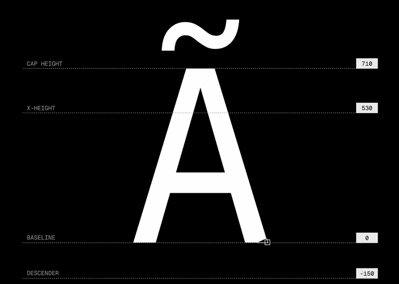
Typography is character. It's the voice of an interface. A serif font whispers formality and tradition. A geometric sans-serif shouts modernity. A handwritten script suggests personality. But typography is also invisible mechanics. It's kerning and leading and measure and weight. The details compound—small choices add up to make something feel either carefully crafted or thrown together.
Many designers obsess over typeface choice: "Should we use Inter or Figtree? Helvetica or Segoe?" These questions matter, but they matter less than how you use the typeface you choose. A beautiful typeface used badly looks worse than a plain typeface used well. And a plain typeface used well looks better than the nicest typeface sized incorrectly or spaced haphazardly.
This essay is about the mechanical details of typography—the parts that don't require choosing a new font, just using your current font better.
The details that compound
Typography is built from layers. At the smallest layer, letterforms have shapes and weights. Layer that up into words, then sentences, then paragraphs. Each layer needs attention or the whole thing breaks.
Small typographic choices accumulate into the overall feel of a page. The difference between a paragraph that feels tight and one that feels open isn't usually the typeface. It's the leading (line-height). The difference between a heading that commands attention and one that gets lost isn't just size. It's size combined with weight combined with spacing.
Three details matter most:
- Leading sets the texture of a paragraph more than the typeface does.
- Measure (line width) decides whether the eye returns to the right line or gets lost.
- Hierarchy is contrast in size, weight, and space working together.
Leading (line-height) controls vertical rhythm within a paragraph. Text set tight (1.2x line-height) feels dense and technical. Text set loose (1.8x line-height) feels spacious and literary. For body text, aim for 1.4–1.6x for most interfaces. For dense content like code or tables, 1.2–1.3x works. For poetry or fiction, 1.6–1.8x breathes better.
Measure controls horizontal comfort. A line that's too short (under 40 characters) forces the eye to jump too frequently. A line that's too long (over 90 characters) makes it hard to find the start of the next line. The sweet spot for body text is 50–75 characters. For headings, shorter is usually better. For dense lists, you might tighten it to 40 characters.
Controlling measure often means constraining width. A typical article should have a max-width of about 680–720px. Narrower than that and text feels cramped. Wider and your eyes struggle to track the line.
Read it out loud
The best test for typography isn't visual. It's auditory. Read the text out loud. Does it flow? Do you lose your place? Do you stumble over spacing that forces you to re-read?
When leading is too tight, you read too fast and might skip words. When it's too loose, you lose momentum. Leading should be invisible—fast enough to flow but slow enough to let each word register.
Measure works similarly. Too narrow and you pause too frequently, breaking rhythm. Too wide and you lose your place. The rhythm should match the content. A technical manual might benefit from slightly tighter measure to aid scanning. A narrative piece should breathe more.
Font weight distribution matters too. If you use only one weight—say, regular—hierarchy disappears. Everything feels equal. If you jump from regular to extra-bold for headings, it feels jarring. Better to use a single, clear contrast: regular body text with bold or semibold headings. This creates hierarchy without drama.
Hierarchy through contrast
Hierarchy isn't just size. It's the combination of size, weight, and space. A heading might be 28px bold with 24px space below it, making it clearly a heading. The same heading in 28px regular with no space below reads as casual text that happens to be larger.
Build hierarchy with intention:
- Pick a body text size that feels readable (usually 14–18px for interfaces, 16–18px for web content).
- Use a predictable scale from that base. Common ratios are 1.2x (conservative) or 1.5x (aggressive). With a base of 16px and a 1.5x ratio: 24px (body), 36px (secondary), 54px (primary), 81px (hero).
- Use weight contrast for secondary hierarchy. Body text in regular, subheadings in semibold, main heading in bold.
- Use spacing to separate levels. More space between a heading and body suggests they're more distinct.
System-level typography
As interfaces grow, typography becomes a system problem. You can't size and space each piece individually. Instead, define a type scale, then apply it consistently.
A type scale typically has 5–8 levels, each serving a purpose:
- Display (64–80px): rare, for page titles or hero sections
- Heading 1 (36–48px): main section headings
- Heading 2 (28–32px): subsection headings
- Heading 3 (20–24px): minor headings
- Body (16–18px): standard text, the most common
- Small (14px): secondary information, labels
- Tiny (12px): metadata, timestamps, fine print
Each level should have a recommended leading and margin below it. Heading 1 might have 1.2x leading and 32px margin below. Body might have 1.5x leading and 16px margin below.
This removes decision-making. A designer doesn't wonder "what size should this be?" They look at what it is (a section heading) and apply Heading 2. The size, weight, and spacing are all preset.
Consistency across the system makes navigation faster for users. They learn the scale and begin predicting hierarchy before reading. "That large thing at the top is probably the most important."
Fonts in context
The typeface matters less than how you use it. But there are a few practical considerations:
- Serif vs. sans-serif: Serif fonts traditionally signal formality (good for news, finance, law). Sans-serif signals modernity (good for tech, startups). Neither is universally better.
- System fonts: Using the system font (SF Pro on Apple, Segoe on Windows, Roboto on Android) makes interfaces feel native and load fast.
- Variable fonts: Modern variable fonts let you dial in weights and widths instead of choosing between presets. They're smaller than loading multiple weights.
- Contrast: High-contrast fonts (thick and thin strokes) look beautiful in headlines but harder to read at small sizes. Low-contrast fonts are easier to read small.
The typeface is a small part of the solution. The scale, leading, measure, and weight distribution matter more.
Testing and refinement
Typography decisions are best validated in real context. A scale that looks good in a mockup might feel wrong at actual text density. Test typography with real content:
- Real article lengths, not lorem ipsum
- Real user names and comment text, not generic examples
- Real data in tables and lists, not ideal scenarios
When you test, you'll find edge cases. Someone's name is 40 characters. A code snippet is wider than expected. A quote is shorter than you assumed. Good typography systems handle these gracefully without breaking.
The mechanical details of typography—leading, measure, weight, spacing—are unglamorous. Nobody will compliment your line-height. But when you get them right, reading feels effortless. When you get them wrong, every paragraph feels like work. That's the difference between good typography and great typography.